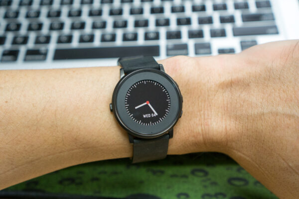
Pebble has managed to stick around, even after the arrival of numerous Android smartwatches and, of course, Apple’s Watch. Their first product, now called the Pebble Classic, raised a record amount of funding on Kickstarter. Their second product, the Pebble Time, also set a new record. Now, Pebble is back with the Pebble Time Round.
While their first two products were really cool gadgets, they perhaps were too geeky for some folks to care to put on their wrists. Pebble has taken their 2nd generation Pebble Time, made some changes to it, and produced the new Pebble Time Round that they hope will appeal to a new category of users.
The Pebble Time Round is round, as you might already have assumed from its name. It’s also thinner, at just 7.5 mm thick, and pretty light at 28 g in weight. The new smartwatch doesn’t just look like a watch, it also feels like a watch. The shape alone may make the difference for some people.
I have the black Pebble Time Round for this review, and it has a 20 mm watch band It’s also available in Sliver and Rose Gold colours, as well as a 14 mm band size.
One of the stellar features of every Pebble smartwatch is their always-on display. The Pebble Time Round uses a 1-inch colour e-paper display, similar to the Pebble Time that precedes it (but squarish-shaped). The e-paper display is really good, with 180×180 resolution, that is easy to read under normal lighting as well as under bright sunlight.
In lowlight or complete darkness, just shake your wrist and a backlight will turn on for a couple of seconds for you to read the display. So in essence, the Pebble Time Round’s display works perfectly in any type of lighting condition.
For those unfamiliar with e-paper display, you might find this display to have dull colours, poor contrast, too low resolution, and overall looking like some tech from a few generations ago. It’s true that it may pale in comparison with AMOLED screens. But e-paper display’s selling point is that they can be always-on, yet draw very little power. On every Pebble (since the e-ink display from the Pebble Classic), the display cannot even be turned off. The backlight can come on and go off, but the display is always displaying something.
There are a couple of physical buttons around the Pebble Time Round’s face. The first one is the “back” button on the left side. Then there are the “up”, “select” and “down” buttons, each clearly separated, on the right side of the smartwatch. The buttons are easy to reach and use. I find it much better than the ones of the Pebble Time. On the older Pebble Time, the right side buttons all seem to join up into one another, and the off-centre button on the left side makes pressing it feel rather unbalanced.
On the underside, you’ll find the magnetic charging connector. It’s proprietary nature means that you had better not lose the charging cable, and you had better bring it along on your travels, or be sure you have one available wherever you might need to charge the Pebble Time Round.
The Pebble Time Round may be just a tweak of the Pebble Time, but its roundness and thinness do mean that there are some compromises. To achieve the thinness, the Pebble Time Round has a much smaller battery. The legendary week-long battery life of the Pebble Classic and Pebble Time is now reduced to two days. In my own usage, I don’t make it to the end of the second day. This means I pretty much have to charge the smartwatch every day. But don’t let this disappoint you too much, because most other smartwatches out there still won’t beat the Pebble Time Round’s battery longevity.
The round display also means that some apps won’t work on the new Pebble Time Round. You won’t, however, miss out on all the basic features of the Pebble Time in the Pebble Time Round.
If you’re unfamiliar with Pebble smartwatches, it’s good to know that Pebble pairs with both Android and iOS smartphones. It’s neither Android Wear nor Apple watchOS, because they run their own Pebble OS. Pebble has their own app ecosystem, and though it’s nowhere as rich as the Android and Apple counterparts, they do have a respectable number of useful apps.
The Pebble’s main user interface revolves around your notifications and upcoming events. You can respond to messages with canned messages, or when paired with Android smartphones, you can use voice to dictate a reply. The voice reply is really quite cool, with the actual voice recognition capability sent to your smartphone for processing.
The Pebble Time Round can do step and sleep tracking, so if this is your thing, this smartwatch has you covered. There are several apps that you can use, apart from the default Pebble Health. There are also other apps from RunKeeper and Garmin to meet different needs.
If you already have a Pebble Time, it’s unlikely that the Pebble Time Round will wow you. It’s different, but not necessarily better. The downgrade in battery life could be a significant thing that existing Pebble Time users might not want to give up. The Pebble Time’s 9.5 mm thickness is already pretty good, but the photo below shows how much more 7.5 mm of the Pebble Time Round does to achieve a sleeker profile.
The Pebble Time Round is available in Singapore, but only in Black and Silver, and only with the 20 mm strap band size. It is retailing at Challenger, Newstead, iStudio, Sprint Cass (Duty-Free) and Harvey Norman for a suggested retail price of S$339.
Conclusion
The Pebble Time Round’s round face and ultra-slim design might be more appealing to those who had avoided the Pebble Time because of the latter’s looks.
Pros:
- Round face, ultra slim
- Light and comfortable
Cons:
- Battery life is just average

