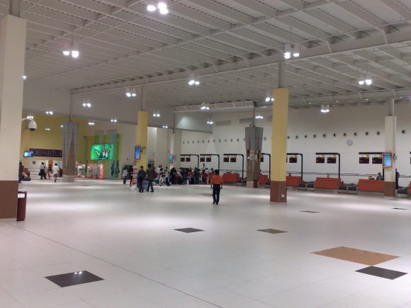
A few weeks ago, I visited our world renowned Changi Airport. Specifically, it was the Cheapo Budget Terminal that I went to. I was very curious about the terminal. I have read a little about how the Budget Terminal is more budget conscious than the regular terminals, but seeing it for real is a lot more telling. My first impression was that the Budget Terminal was simple, like a smallish airport one would expect to find in lesser travelled locations in the first world countries.
But after trying to “use” the facilities, as opposed to just “viewing” it from a distance, I couldn’t help but think that they have purposefully designed the terminal to be inferior.
For example, after dropping off my passengers and attempting to get into the car park, the misleading road signs led me into a circle, looping back to the terminal without reaching the car park entrance. Maybe it was night time, and therefore dark, so that I didn’t get my directions right. When I got into the car park, and tried to park my car, I realised that there was no curb at the back of the vertical parking lot, so that if one were not careful, one could have driven over to the lot on the other row. How much does building a curb cost?
The few chairs in the Budget Terminal were not in very good condition. I’m surprised, considering the newness of the terminal. You don’t find chairs in the regular terminals getting “seasoned” so quickly.
I got the sense the terminal design might have been purposefully assigned to a newbie architect with zero experience. Perhaps the architect was even instructed to purposely make some catastrophic usability errors, in order that budget travellers would receive suitably discriminating services. Things like colours and plants could lend an atmosphere of warmth without adding appreciable cost. Why not improve the “ambience” a little?
