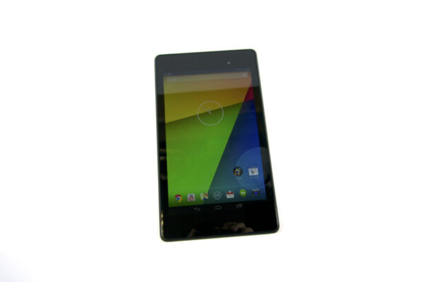
Google launched the 2nd generation Nexus 7 in July this year. It’s a slim, svelte 7″ tablet that offers you the pure Android experience. It’s got pretty good hardware specifications, and costs less than you’d expect. It’s definitely improved from the 1st generation Nexus 7, but is it good enough to set the benchmark for Android tablets in 2013?
The new Nexus 7 continues to be made by ASUS. Although both generations of tablets share some design similarities, they are easy enough to tell apart. The 2nd generation Nexus 7 is narrower (114 mm vs 120 mm), thinner (8.65 mm vs 10.56 mm), and just slightly taller (200 mm vs 198.5 mm). It’s somewhat lighter (290 g vs 340 g). Physically, the new tablet is slim, svelte, light and easy to hold.
Once you turn on the Nexus 7, you’ll be awed by the new display. It is a really impressive 7.02″ IPS LED screen, sporting a screen resolution of 1920×1200, which gives you a pixel density of 323 ppi. This is currently the highest pixel density on any tablet. The display is simply gorgeous, rendering content with amazing clarity. Colour is also brilliant. The only fault I have with the display is that the glass surface is too reflective.
Under the hood, the Nexus 7 has a 1.5 GHz quad-core Snapdragon S4 Pro processor with a 400 MHz quad-core Adreno 320 GPU and 2 GB of RAM. The main (rear) camera is 5.0 megapixels, capable of shooting 1080p video, while the front camera is 1.2 megapixels with 720p video recording capabilities. In the connectivity department, there is dual-band 802.11 a/b/g/n (sadly no ac), Bluetooth 4.0 LE, and NFC. Cellular versions of the Nexus 7 have LTE support. Other ports include a microUSB 2.0 port, and a 3.5 mm headphone jack. Internal storage is 16 GB or 32 GB (depending on model), and like many other Nexus flavoured devices, there is no removable storage support.
The hardware specifications are, I’d say, “up to expectations” for a 2013 tablet. Aside from that, the more important matter is the real world user experience. In that respect, I’m truly impressed with the smoothness and fluidity of the Android experience. The Nexus 7 was launched with Android 4.3, but has now already received the Android 4.4 KitKat upgrade. The interface is very responsive. Transitions and animations are buttery smooth. For the first time, this is something I consider to be “on par” with the iOS experience on an iPad or iPhone. (Though in all honesty, I found my iPad 4th generation to have lost its fluidity after upgrading to iOS 7.)
The Nexus 7 demonstrates that the pure Android experience can be truly impressive. No need for vendor gimmicks and feature bloat. The pristine Android operating system is capable of delivering a great real world experience.
With everything seeming to be so great about the Nexus 7, one would wonder if it would be priced at a premium. It’s not. The 1st generation Nexus 7 launched at US$199 and US$249 for the 8 GB and 16 GB models respectively. This year’s Nexus 7 comes with either 16 GB or 32 GB storage, and they are priced at US$229 and US$269 respectively (Wi-Fi only models). At the 16 GB storage level, the 2nd generation Nexus 7 is actually cheaper than before. For price comparison purposes, the 16 GB Wi-Fi only iPad Mini costs US$299.
Conclusion
It may still be premature to decide on the best tablet of 2013, since there’s still two odd weeks left till the end of the year, but the Nexus 7 is certainly a great contender for the top spot 7″ Android tablet.
Pros:
- Slim, svelte, and light package
- Gorgeous 1920×1200 resolution 7.02″ IPS LCD display
- Overall great Android experience
- Competitive price
Cons:
- Screen is a little too reflective
- Lacks removable storage, 802.11ac support
