

It happens. From time to time, a software or system is updated, and although the update is supposed to be an upgrade, users sometimes feel like it’s more like a downgrade. I can appreciate that new bugs can creep in with updates, but sometimes it feels like important features are removed, or the overall user experience has become crippled.

Such is the case with Adobe’s Lightroom update earlier this week. Adobe introduced some changes in Lightroom 6.2 an Lightroom CC 2015.2, including significant changes in the import workflow.
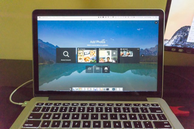
First, the user interface has changed somewhat. The first time I attempted to import photos after the upgrade, I was surprised by the new, dumbed down, look. In what should have been an extremely streamlined process for me to copy photos from my camera to my notebook, I now had to pause to figure out what has now being presented before me. I want to make sure that my photos were going to be handled the correct way. This jarring change was disruptive and unproductive.
If the experience is changed for some significant benefit, perhaps I could get over it. But that wasn’t the case. In the beginning, there were maybe just a few annoyances that I noticed. However, I eventually noticed that there were more, and that others are similarly complaining about it.
This, for example, is annoying but perhaps I could put up with it: In the new import workflow, Lightroom has removed the option to automatically eject an external media, such as a SD card, after photos have been imported. Now, I have to remember to manually tell the operating system to eject the card before I physically remove it. This sounds like a small matter, but auto-eject was great, worked just fine, and loved by busy people who just want to pop in and pop out SD cards without thinking too much. Why did Adobe have to remove this feature?
A greater handicap is how images that are selected for import are now greyed out and have large tick icons obscuring the image. It makes it very difficult to make out what those images are. Doesn’t it make more sense to grey out images that are not selected for import? Selected or not, I still want to be able to make out what the images are, so obscuring them, especially with a large, opaque, icon is just absolutely unacceptable.
There are many more problems:
- If you import images from a SD card, you can now only copy them, and not move them. Now, you’ll have to separately remove the images from your SD card. I’d agree that copying is probably safer, but some people may have other workflows that already provide satisfactory backup assurance.
- You can’t import duplicate photos anymore. I hope Adobe is dead sure that their duplicate detection algorithms are perfected.
- You can’t preview destination folders, that is, where your images are going to be stored after import. This is important, because it gives you peace of mind that, when you change the destination settings, your images will indeed go into the place you had intended them to be.
Regular Lightroom users may find more problems in the new Lightroom that irk them. Meanwhile, I’ll like to quote from Adobe’s blog posting on this Revamped Import experience:
We redesigned the Import experience to make finding and importing your photos easier and more visual. The redesign was driven by our desire to make the import workflow more explicit and clear. The workflow is 1. Select a source, 2. Select images 3. Choose any import settings (optional) and 4. Import.
The revamped Import experience is based on customer feedback and we’re excited to hear what you think.
— http://blogs.adobe.com/lightroomjournal/2015/10/lightroom-cc-2015-2-now-available.html
Well, Adobe, the new import experience is neither easier nor more visual. It has become a bit fuzzy, and I’m not sure what is going on now.
Please let us have the old Import back.