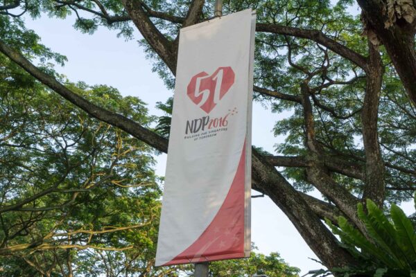
Forgive me for saying some unpatriotic things. But there’s this logo that has bothered me for some time. It’s about the National Day Parade (NDP) 2016 logo. I thought it looked rather inauspicious. Don’t you think it depicts a broken heart? The strokes of the number “51”, appears to have ripped the heart into three parts.
Without reading up on the official meaning of the logo, I guessed that the heart represents Singapore. The “51” is for our nation’s 51st birthday. You take a look at it again, it looks like our 51st birthday has broken up Singapore?
There’s worse to it. To be honest, when I first saw the logo from afar, I thought the “5” looked like a bolt of lightning. To Singaporeans, the lightning refers to that certain party.
The “1” has already broken one-third of Singapore away. Now, the “5” has fractured the other two-thirds as well?
I’m really sorry, but this logo seems really bleak. The red heart could have had a happier meaning, since red is our national colour. Red is auspicious to Chinese too, as it represents good fortune and happiness. But here? A bleeding heart perhaps?
The heart shape itself, instead of having smooth curves, seems to be rather edgy. Okay, so up-close I see that they are made up of triangles. I don’t know if there’s any significance to using triangles. The end result, though, is an edgy looking heart. A Singapore that’s fracturing and bursting at the edges?
So here’s my interpretation of the : A bleeding Singapore, fractured and bursting at the edges, torn apart once, and then again by lightning.
I know it’s easy to criticise. I probably can’t come up with a better logo myself. But every time I see the NDP 2016 logo, I see a broken heart, and it makes me sad.

