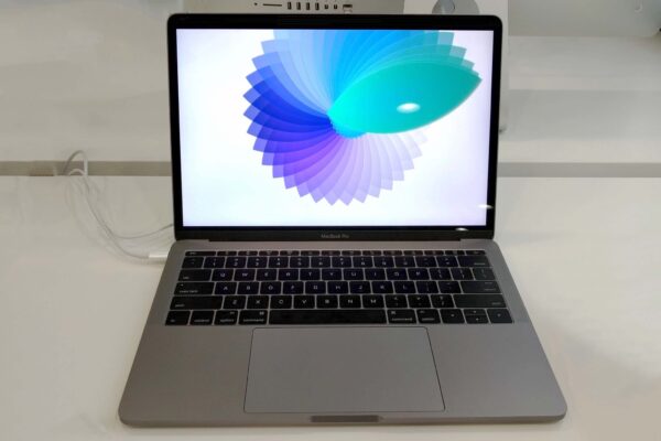
Apple’s late 2016 release of updated MacBook Pros has unleashed quite a bit of storm. Despite strong criticisms that the new MacBook Pros, particularly the entry-level one without the new Touch Bar, didn’t bring any significant improvements to the table, they actually still outsold any previous MacBook Pro, and including all the competition, in just the first five days.
I had the opportunity to try out the entry-level 13-inch MacBook Pro. It started shipping the week after Apple’s announcement. This is the basic model that Apple has positioned as a replacement for the 13-inch MacBook Air, which, incidentally, it’s last update in early 2015 is still available for sale.
The new entry-level MacBook Pro makes for some confusion. You see, it has the “Pro” moniker, but Apple tells you it replaces the MacBook Air. Furthermore, the underwhelming specs remind you that it really isn’t quite up to par with its Touch Bar endowed brethren. It has half the number of Thunderbolt 3 USB-C ports, and its processor starts at a lowly 2.0 GHz dual-core Intel Core i5 Skylake model, though that may be upgraded to a more respectable 2.4 GHz dual-core Intel i7 Skylake processor in a built-to-order configuration.
At any rate, the slower memory (1866 MHz vs 2133 MHz on the Touch Bar models) and lower end integrated graphics (Iris Graphics 540 vs Iris Graphics 550 and upward on the Touch Bar models) confirms this Pro will struggle to earn its keep.
Probably, the only benefit of this entry-level MacBook Pro is battery life. Although Apple states the same 10-hour battery life across all the late-2016 MacBook Pros announced, the entry-level MacBook Pro’s 54.5 Wh battery is larger than the 13-inch Touch Bar model’s 49.2 Wh one, and its base processor option draws lesser power, so we’ll expect it to run longer.
Fortunately, you do at least get two Thunderbolt 3 / USB-C ports. Last year’s 12-inch MacBook with just one USB-C port was really tough to use.
The new MacBook Pro is smaller and lighter than the last generation. It’s almost the same weight as the 13-inch MacBook Air (the latter is just 0.01kg lighter), and less voluminous overall. If you liked the MacBook Air for its portability, the new MacBook Pro is equally good.
The display glass extends all the way to the edges, like previous MacBook Pros. There’s significantly less bezel space too. This makes the new MacBook Pro smaller in area, and thus less voluminous than before.
Interestingly, the words “MacBook Pro” are emblazoned on the bottom of the glass display, like you need to be reminded that you how have a “Pro” notebook. I find this display of branding totally unnecessary. It’s not there in the old MacBook Pro, though it is on both the MacBook Air and MacBook. Another change is that the Apple logo on the back of the display is no longer backlit. Once upon a time, you could look up at the audience in a conference hall and see the sea of Mac notebooks facing you; now it will be harder to make out the proportion of Mac users in a crowd like that, not that it’s something really important.
The keyboard from last year’s 12-inch MacBook has been brought over to the new MacBook Pro. Apple says it’s using a newer, second-generation butterfly mechanism under the keys. For many people, the ultra-flat keys that have little key travel might seem to be a problem.
The keyboard is very important to me. I use the keyboard extensively, and prefer using keyboard shortcuts to pushing mouse pointers around the screen.
I put the keyboard to test and found that, surprisingly, if you don’t think about the flatter keys, they work just fine and I can type just as effectively as I could on the older MacBook Pros. Deeper keys might seem much more comfortable to type on, but I think I can get used to this new keyboard.
As if to make up for the lack of a Touch Bar, this MacBook Pro has an extra large Escape key. Useful, I’m sure, to vi users like myself, but perhaps won’t be appreciated much by most other people.
The huge trackpad, 50% larger than the last MacBook Pro, is a joy to use. Apple doesn’t want to go with touchscreen displays on their notebooks, and it seems like the large trackpad, as well as the Touch Bar on the higher-end MacBook Pros, are designed to make up for that. While there are certainly pros and cons with using a touchscreen, I’m secretly happy that Apple has decided for us.
The one thing I would love to see on the MacBook Air is a Retina-resolution display. The entry-level MacBook Pro is aptly suited as its successor in this regard. However, the MacBook Pro does have a “pro” price tag, so it makes the upgrade decision a tough one.
For MacBook Air upgraders, do you go for the 12-inch MacBook or the entry-level MacBook Pro? One’s pricey and very underpowered, the other is even more pricey but lesser underpowered. The entry-level MacBook Pro is not pro enough, but removing the “Pro” moniker doesn’t make choosing the MacBook Air upgrade any easier.
The entry-level 13-inch MacBook Pro starts at S$2188 and is available now.

