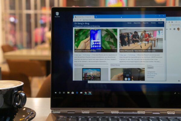
I am delighted today to unveil a fresh new look for my blog website, ZitSeng.com. It’s the same blog on the inside, but it sports a new coat of paint on the outside designed to enhance the visual experience for visitors to the website.
This visual refresh project has been brewing for some time. While I do make incremental design enhancements from time to time, this update is probably one of the more substantial updates in a long time. There are plenty more under-the-hood changes than is visually apparent.
You may see that the overall thematic styles seem to have been carried over from the old to the new. I’m not going for a complete revamp. There are many elements of the old theme that I still like, notably my careful selection of primary fonts, Oxygen and Glegoo, which continue to be used. The new design is very recognisable as an evolution of the old one.
Visitors come to a website for its content, or at least that ought to be mostly the case. Hence, a website’s visual design has to focus on content consumption. Readers should not feel distracted by other elements on the page.
To this end, this update focuses on a design that is lighter, more spacious, and cleaner than before. It may even look a little sparse, like reading an e-book on a Kindle. There is a minimum of style variations, minimal use of colours and shade in the theme, and I try to keep everything simple. There is elegance in minimalism.
There’s quite a lot more going on with the new front page layout. I use more eye-catching visuals, and the page space is better utilised. There’s actually less content visible above the fold, but I feel the new arrangement is more inviting than before.
Although I’ve likened the new design changes to a fresh coat of paint, the truth is that the underlying theme is completely new, completely different from before. The reason has got to do with the changes coming in WordPress 5.0. I was reminded in the recent WordPress 4.9.8 update which, although considered a minor upgrade, rolled out with a call to try the new Gutenberg editor.
Gutenberg will become the new default editor in WordPress 5.0. It is a completely different editor, and a complete change in the WordPress editing experience. Gutenberg starts out as just being an editor in the next major release of WordPress, but its roadmap is to revolutionarise customisation and site-building in WordPress.
I’ve no issue with using a new editor. It’s cool to have one that is as powerful as Gutenberg. The problem, however, is that when using Gutenberg, there is a complete mismatch between the front-end and back-end theme styles. The old methods to keep front-end and back-end styles in sync, which have worked with the TinyMCE editor in previous versions of WordPress, don’t work with Gutenberg. The fix, unfortunately, is not trivial.
Although content is most important, and writing should focus on that, at some point I need to look at layout and visual presentation. At this juncture, a WYSIWYG editor is extremely important to me. Switching back and forth between edit and preview just doesn’t work for me. The editor itself has to show the final presentation as accurately as possible.
I have been building my own theme for many years, with much hacking and kludges through the numerous versions of WordPress over the last 10 years. While evaluating the work needed to bring my theme up-to-date with the new Gutenberg editing experience, I found that there were so many things to do that I didn’t know where to start.
I came to the sad conclusion that it would probably be better to simply start afresh. On the bright side, it is an opportunity to get rid of the years of inelegantly written code in my theme.
Hence, I embarked on a mission to build a brand new theme for this blog website. I didn’t have to start completely from scratch, however. I used the very excellent Gutenberg Starter Theme. This gave me a very helpful jump start to my own theme project.
With a clean start, I’m now using WordPress APIs properly, and generally do things the way the WordPress developers had intended.
Most importantly, I get to achieve my objective of a 100% true and accurate WYSIWYG visual editing experience with the new theme.
Since I was rebuilding the theme, it made sense to work on the other design ideas that I had. It’s a fresh start, after all, and I was starting with a brand new styles.css.
There are some downsides with starting afresh. My previous theme had been highly optimised for download size, download time, PageSpeed core and YSlow score. I haven’t been able to keep up with those achievements in this new theme. Further optimisations will be in my to-do list.
I believe the new look will serve its purpose to enhance the overall content consumption experience. I will still write about technology, lifestyle, Singapore, and other random topics from time to time; this blog has not changed. I hope to see you around!
