
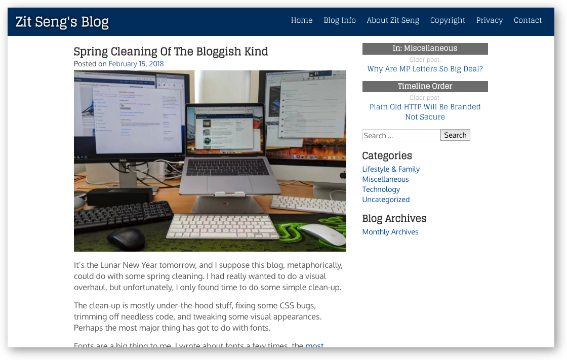
It’s the Lunar New Year tomorrow, and I suppose this blog, metaphorically, could do with some spring cleaning. I had really wanted to do a visual overhaul, but unfortunately, I only found time to do some simple clean-up.
The clean-up is mostly under-the-hood stuff, fixing some CSS bugs, trimming off needless code, and tweaking some visual appearances. Perhaps the most major thing has got to do with fonts.
Fonts are a big thing to me. I wrote about fonts a few times, the most recent in 2016 when I switched to Fira Sans Light and Merriweather, for the header and body font respectivevly. I later changed to Raleway and Fira Sans Light.
In the last year, I see significant blog readership from mobile devices. In fact, I find myself reading a lot from my smartphone too. This leads me to think about optimising the reading experience for mobile users. It’s one thing to design for desktop while also looking good on mobile, but it’s another level up to truly optimise for both platforms. That’s not as easy as just slapping on a responsive UI design. This is difficult for me since I’m not a designer. I run infrastructure, I write code, design is quite a different league.
Anyhow, I decided to just focus on a font refresh this time around, and I embarked on a font search. Something with a modern flavour, something that says tech. I happened to chance upon the very excellent Glegoo font, which I experimented as a body font, loved it tremendously, but had trouble finding a header font that would pair with it. Glegoo’s large x-height and large counters make for very easy reading, but the slab-serif style and delicate strokes work better in headers than in body text. Although I very much wanted Glegoo for my body font, I ultimately came to the realisation that it was far easier to use it as a header font, and find something else to use in body text.
I continued on my font hunt, mostly hoping to find something suitable from Google Fonts, though I did peek at other font foundries too. I finally selected Oxygen. This font was originally designed for use with the KDE desktop, so it might perhaps look familiar to some people. It renders very well on screens, since, after all, it was meant to be used in the KDE desktop. Oxygen is a sans-serif style font having good x-height and large counters. However, while Glegoo has a subtle blockish look, even the slabs aside, Oxygen is perfectly curvy. Glegoo and Oxygen may share several similar characteristics, but they are distinctly different. It renders very well on screens. In opinion, they complement each other well.
Both Glegoo and Oxygen meet all my requirements:
- The letters ‘I’ (capital-eye), ‘l’ (small-ell), and ‘1’ (number 1) must be easily distinguishable from each other. This is clearly the case with Oxygen. Glegoo’s ‘I’ and ‘l’ have admittedly similar glyphs, though it’s not difficult to see that they are different. I figured this is lesser of a problem in a headline, and in larger sizes.
- While the above glyphs tend to be the more common problematic ones, good thing here that the lesser common problems are all absent too. Examples are: ‘i’ and ‘j’, where sometimes the descender of the ‘j’ is too little to make the glyph too similar to ‘i’; or the punctuation mark period and comma are too close to make it easy to read wrongly at small font sizes.
- The fonts are easy to read, having large x-height and large counters, they feel spacious and roomy.
- The fonts look normal, and serve the purpose of rendering text to be read. Glegoo and Oxygen are not fancy looking, and won’t call attention to themselves, rather than the content that people want to read.
For future reference, here’s how the webpage looks (at non-retina resolution).
I fuss a lot about fonts. To me, they serve an important role to complement content, to facilitate and encourage content consumption (i.e. to read). Sometimes, you don’t read not because the content is uninteresting, but because the delivery of that content makes it unappealing to read.
Trying out new fonts will require at least some simple mock up so that you can see how things look. You need to see how two different fonts will work with each other, and particularly at the sizes that you will use them. There’s one important tool that I’ve been using: Typecast Public Demo. This is a web-based tool for designing with web fonts, and allowing you to add content, customise styles, and otherwise create a mock up that can meaningfully represent how it would look with your actual website.
A recent message on Typecast’s website reads: we are no longer providing support for Typecast. I’m not sure exactly what that means, and there doesn’t seem to be a link providing more information. I hope the tool above continues to be around.
There are two more tools that come in very useful to help browse font pairings. The two are related actually: OurOwnThing’s Font Pairing, and archetype. These are good places to start if you’ve no idea what fonts you might fancy, because they provide you with a quick way to try them out and see how they’ll look with some simple content.
I’m pleased to present the new font pairing at ZitSeng.com to welcome the new Lunar New Year. To all those who celebrate Lunar New Year, here’s wishing you a happy and prosperous new year ahead. For all others, you have a happy and prosperous year ahead too. There’s also the long weekend to enjoy!
View Comment Policy