Fonts, and more generally, typography, are important components of a website that impact user experience. I’ve always given considerable thought in selecting the fonts to use in my blog website. Over two years ago, I chose Metronic Slab Pro and Mariné Light. This week, I’ve decided to freshen things up a little bit with a new pair of fonts.
In the early ages of the web, trying to mind the fonts used in a website design was quite impossible. These days, web fonts are quite well supported, in one form or other, by all major web browsers. It’s easy to select custom fonts, and ensure uniform rendering across different browsers on different platforms. You don’t have to go with the default font chosen by the web browser or operating system.
Of course, being able to choose fonts easily only means just that, not necessarily that fonts will be chosen sensibly. Designing new fonts is hard work. Choosing them is easier, but it’s a lot more than simply what tickles your fancy.
I have some hard requirements for fonts chosen for body text. They are not much different from what I wrote previously, though there are some refinements and :
- The letters ‘I’ (capital-eye), ‘l’ (small-ell), and ‘1’ (number 1) must be easily distinguishable from each other. I also like to see that all glyphs look sufficiently different, so that it’s not easy to misread them. Sometimes, for example, the ‘O’ (capital-oh) and ‘0’ (number zero) look too similar, or the ‘j’ (small-jay) looks too much like the ‘i’ (small-eye).
- The font should be easy to read. This often means a serif font. It helps a lot that nowadays many screens have high enough display resolution, that rendering of serif fonts even at small sizes is practical and looks good.
- I like the typeface to feel “spacious” and “roomy”, with a high x-height and big counters. I want to see clarity and separation in the strokes.
- The font needs to look normal. People want to read content, not admire fonts. While the font is important, it shouldn’t call attention to itself.
The rules can be relaxed a little for header font, but still it will be good to meet those requirements too. Additionally, for header fonts:
- The font should be easily distinguishable from the body font, and it should stand out from the body font.
- The font must be in harmony with the body font. This is something difficult to quantify in just a few words, but the gist of it is that they should look good together.
The last time I was out searching for fonts, Google Fonts didn’t have a good enough selection, so I ended up going with choices from other font platforms.
This time, Google Fonts worked for me. My pick for the body font is Merriweather Light. Merriweather is actually quite a popular font, featured in more than 1.6M websites according to Google Fonts’ statistics. Of course, it’s still no where near to fonts like Open Sans that is seen in more than 18M websites, again according to Google Fonts’ statistics.
Merriweather meets all my requirements for a body font.
For the header font, I chose Fira Sans Light. This is quite an uncommon font, comparatively, and it’s featured in just a little over 70K websites according to Google Fonts’ statistics. Although a sans-serif font, its glyphs for ‘I’, ‘l’ and ‘1’ are all clearly different. To be honest, I’m really annoyed with Helvetica, even the newer Helvetica Neue, that so many people like to use (by choice or otherwise), simply because of the ‘I”, ‘l’ and ‘1’.
Fira Sans Light also renders well at small sizes, so I can easily use it in non-header areas, such as in instances where I have to set text differently from the main body content.
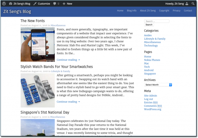
Here’s a screenshot of the current homepage, taken from a Retina display.
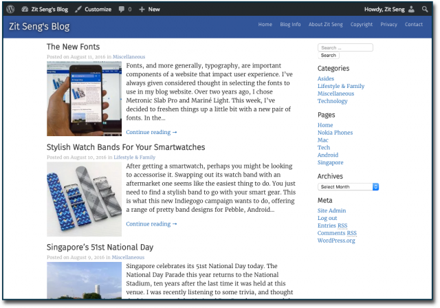
Here’s the same screenshot, but taken from a regular non-Retina display.
The actual webpage rendered on a Retina display looks better.
I also did choose a new monospace font. It was Klartext Mono previously, now changed to Source Code Pro.
Although all these fonts are accessible through the Google Fonts API service, I prefer to host the font files myself for a variety of reasons. Google Fonts doesn’t make the files conveniently available, but you can use the localfont web service.
The new fonts are actually smaller in size too, a nice (but important) benefit. Every file format of the new font is smaller than the corresponding old font. The summation of all the new EOT, SVG, TTF and WOFF files is about 374K, versus 827K with the old ones. With modern browsers, you get WOFF files only, which total 42K with the new fonts, versus 98K with the old fonts.
The fonts of Google Fonts these days are quite plentiful, so you might have a good chance to pick up something you like and works for your project.
Note: If you are reading this post as a Facebook Instant Article (i.e. you clicked from a Facebook link on a mobile device), you’ll need to visit the actual post on my website to see the current font rendering.


View Comment Policy