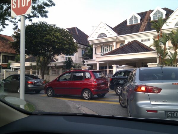
One of the worst things about driving in Singapore (and perhaps many other cities in the world) is getting stuck in traffic jams. It’ll be really nice if we could all somehow have detailed realtime traffic information about all the major roads in Singapore. The Traffic Watch announcements on radio doesn’t work out very well. You can’t get the information when you want it, because you have to depend on the deejay of your chosen radio station to read off the information. Checking on the Internet isn’t always very convenient, particularly when you are already on the road.
I think the way Google Maps shows traffic information is probably the most convenient interface. Combined with location information, the map can automatically zoom in on your current location and show you traffic conditions around you. You can also easily browse over the areas where you plan to travel through.
Right now, Google Maps show colour coded roads that indicate the traffic condition. Simple and concise. There are just two problems with it, imho.
- The accuracy of the information. I suppose the data being fed into Google Maps just isn’t accurate enough.
- I’m sure if there is some description of what red, yellow and green means. I know, red is worse than yellow, which in turn is worse than green. But can we translate that into more definitive terms? Maybe even show the average travel speed on that stretch of road.
I’m sure all these will be very handy inputs to route planning, particularly when drive navigation is introduced for Google Maps in Singapore.
