 I update my blog design from time to time, but I’ve never had an archive of how the design has evolved over the months and years. As I look back, I thought it’ll be nice to catalog how the site has developed through time. The bigger picture, yet, is not just about design, but also how other aspects of the blog has changed.
So here I am with an update, this one primarily about blog design. Things don’t change very fast around here, because ZitSeng.com is an after-hours hobby. I’m also not a web designer by profession, nor even as a hobby, but I do mind that websites should be designed to fit their purpose.
To this end, the blog design at ZitSeng.com has always focused on simplicity. I believe blogs, or at least this blog, is about content. People don’t come to be wowed about beautiful design. However, beautiful design can supplement and add to the enjoyment of the site’s content. That’s my design principle at this blog.
 The design is clean, simple, and clutter-free. There’s relatively few distractions for the reader. Adequate whitespace help readers focus on content.

If you’ve noticed that the fonts look unique, you’re right. They aren’t in the standard font collections that come with your operating system. In fact, I’ve been using custom fonts for some time. At this time, I use:
- Mariné Light: Most body text is set in Mariné Light. It’s a beautiful low contrast geometric sans serif font with a humanist touch.
- Metronic Slab Pro: Titles and headlines are set in Metronic Slab Pro. This is a slab serif typeface with a technological and minimalist look for text and headlines. This typeface contrasts well with Mariné Light, making them a great combination for setting headline and body text.
- Klartext Mono Light: Code and other fixed-width text is set in Klartext Mono Light. This monospaced font combines modern monolined sans-serif with a humanist touch. It features soft curves and a large x-height, making it easy to read code.
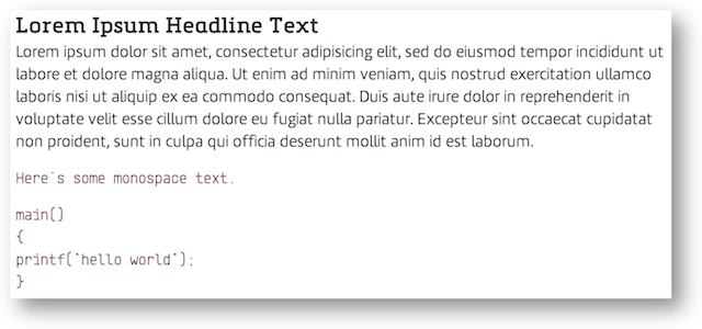
The screenshot above (or the others prior) don’t do justice to the finesse of the fonts. The actual fonts render much better by web browsers. The images you see are at normal resolution. I’ve tried uploading “retina resolution” images and letting the browser do its down-scaling, but the results weren’t good either.
Just look at this page to see how the headline and body fonts render in your browser. (Of course, I may change the website fonts in future, and the fonts you see on this page may not be the same anymore, hence still the need for a screenshot to preserve the look.)
These fonts I’ve chosen have the letters ‘I’ (capital eye), ‘l’ (small ell) and ‘1’ (one) clearly distinguishable from each other. I find myself very frustrated when these respective glyphs are difficult to distinguish from each other.
I could write a whole lot more about fonts, but I suspect most people aren’t going to be terribly interested. I’m not a typography expert either, in the same way I don’t consider myself a web design expert. But I mind that the text should look nice. Beautiful fonts make a difference. A favourite example of mine is http://www.fastcodesign.com/.
So this is what I have at ZitSeng.com now. The current base design has been around for perhaps a year. I had a font change about three months ago, and then I had the design tweaked for a responsive mobile layout. Earlier this month I cleaned out some lines for more whitespace. These are all relatively small changes, as is the case most of the time.
View Comment Policy