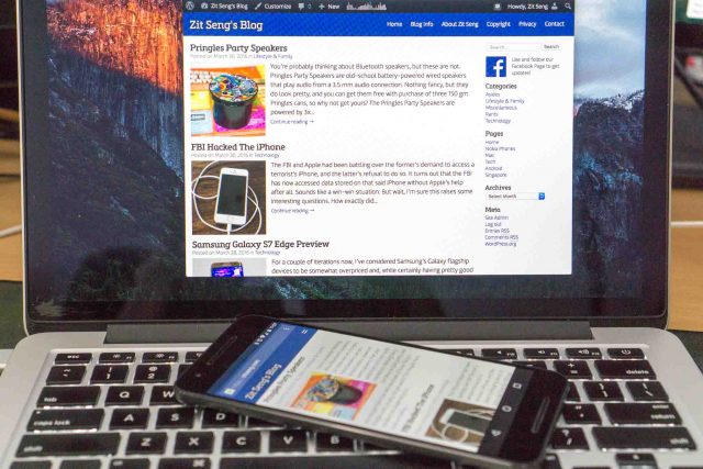
Two years ago, I updated my website to incorporate a modern responsive web theme. The menu, though worked just fine, wasn’t quite mobile themed enough on mobile screens. It was something I wanted to fix in a later update. I’ve finally come around to that, and I thought I’d share my recipe.
The new responsive menu is a bit overdue because I just could not find something that both appealed to me visually, and satisfied my under-the-hood technical requirements. You could easily find something that looked beautiful, but not something that featured:
- Compact CSS.
- Minimal HTML styling.
- No JavaScript.
I’m pretty much a competent programmer, at least I think, but you see, I don’t do JavaScript and I’m not quite up-to-speed with the latest CSS developments. Most of the time, I do by looking and copying. That’s how I’ve been learning about stuffs on the web.
Something finally came up. I don’t know who to credit, but it’s menu is basically described as “bootstrap like responsive navigation (no js)“. I did need to make some adjustments to better meet my needs. You see which works better for you.
Let me explain a little about the issue about compact CSS. I want to include all the menu CSS inside my HTML (although I’ve left them in a separate file in the example below), so that all the CSS needed for above-the-fold page rendering would be all there. Yup, it’s to get rid of PageSpeed’s complaint about “Eliminate render-blocking CSS in above-the-fold content”.
Here’s the HTML and CSS to illustrate a basic example to illustrate what you need to do.
<!DOCTYPE html>
<html>
<head>
<title>Site Title</title>
<link href="style.css" type="text/css" rel="stylesheet" />
</head>
<body>
<header class="clearfix">
 <div class="header-left">
 <h1>Site Title</h1>
 </div>
 <div class="header-right">
 <input type="checkbox" name="open" id="open">
 <label class="menuicon" for="open">
 <s class="menubar"></s>
 <s class="menubar"></s>
 </label>
 <nav id="menu">
<ul>
<li><a href="#">Home</a></li>
<li><a href="#">About</a></li>
<li><a href="#">Partners</a></li>
<li><a href="#">Servers</a></li>
<li><a href="#">Contact</a></li>
</ul>
 </nav>
 </div>
</header>
<div id="main">
<p>Lorem ipsum dolor sit amet, consectetur adipiscing elit, sed do eiusmod tempor incididunt ut labore et dolore magna aliqua. Ut enim ad minim veniam, quis nostrud exercitation ullamco laboris nisi ut aliquip ex ea commodo consequat. Duis aute irure dolor in reprehenderit in voluptate velit esse cillum dolore eu fugiat nulla pariatur. Excepteur sint occaecat cupidatat non proident, sunt in culpa qui officia deserunt mollit anim id est laborum.</p>
</div>
</body>
</html>
Here’s the CSS that goes into style.css:
*{
 margin: 0;
 padding: 0;
 outline: none;
 border: none;
 -webkit-box-sizing: border-box;
}
*:before,
*:after{
 -webkit-box-sizing: border-box;
}
html{
 font-family: Helvetica, arial, sans-serif;
 font-size: 12px;
}
.clearfix {
 *zoom: 1;
}
.clearfix:before,
.clearfix:after {
 display: table;
 line-height: 0;
 content: "";
}
.clearfix:after {
 clear: both;
}
header{
 width: 100%;
 height: auto;
 background: #335599;
}
.header-left,
.header-right{
 position: relative;
 color: white;
 float: left;
 padding: 0 1em;
}
.header-right label{
 position: absolute;
 top: -3em;
 right: 0;
 cursor: pointer;
}
.header-right{
 float: right;
 text-align: right;
}
#open{
 display: none;
}
h1{
 font-weight: 300;
 line-height: 40px;
}
a{
 text-decoration: none;
 color: white;
}
#menu>ul{
 padding: 0;
}
#menu>ul>li{
 list-style: none;
 display: inline-block;
 font-size: 90%;
}
#menu>ul>li>a{
 position: relative;
 display: inline-block;
 font-size: 13px;
 line-height: 40px;
 padding: 0 1em;
 -webkit-transition: all .3s ease;
}
.menuicon{
 display: none;
}
#main {
 padding: 1em;
}
@media (max-width: 600px) {
 #menu{
 max-height: 0;
 overflow: scroll;
 -webkit-transition: all .3s ease;
 }
 input[type="checkbox"] + label{
 -webkit-transition: transform .3s;
 }
 input[type="checkbox"]:checked + label{
 -webkit-transition: transform .3s;
 }
 input[type="checkbox"]:checked ~ #menu{
 max-height: 500px;
 -webkit-transition: max-height .5s;
 }
 #menu>ul>{
 margin: 0;
 }
 #menu>ul>li{
 display: block;
 background: #333;
 font-size: 100%;
 }
 #menu>ul>li>a{
 padding: 0 1em;
 display: block;
 border-bottom: solid 1px rgba(255,255,255,.1);
 }
 h1{
 }
 .header-left,
 .header-right{
 width: 100%;
 }
 .header-right {
 padding: 0;
 }
 .menuicon {
 display: block;
 width: 34px;
 height: 34px;
 }
 .menuicon .menubar {
 background-color: #ccc;
 display: block;
 width: 20px;
 height: 3px;
 position: absolute;
 top: 19px;
 right: 7px;
 transition: all 0.5s;
 }
 .menuicon .menubar:first-child {
 transform: translateY(-7px);
 }
 input[type="checkbox"]:checked + label .menubar{
 background-color: #ee3333;
 transform: rotate(45deg);
 }
 input[type="checkbox"]:checked + label .menubar:first-child{
 transform: rotate(-45deg);
 }
}
The CSS looks a bit long, but some of it is probably already used in your own stylesheet, or you might do away with them altogether. As it stands, the CSS is 2322 bytes big, but after minification and gzip compression, it’s just 697 bytes.
You can check the demo of the above files here.
And if you must know… I did ultimately still cheat by adding one line of JavaScript. Without JavaScript, the menu is still completely functional. The JavaScript fixes a quirkiness when you return to a webpage that had the menu open when you are in mobile mode.

View Comment Policy