The original Pebble smartwatch was the most successful Kickstarter project in its time. Three years later, the Pebble Time 2nd generation smartwatch smashed through Kickstarter’s record again, this time around delivering practically on time. It’s also looking to be one outstanding smartwatch.
To be honest, I wasn’t expecting Pebble to survive the onslaught of Android and Apple smartwatches. Back in 2012, there was little competition. But in the last three years, the smartwatch landscape has changed tremendously. So I was pleasantly surprised to hear Pebble launching a campaign for their 2nd generation smartwatch, and even more that they raised over US$20M in funding from Kickstarter backers.
A big part of the original Pebble’s success was the use of e-paper, enabling the smartwatch to run for over a week without a recharge. The new Pebble Time builds on that success. This time around, the e-paper display technology has gone one up with a cool 64-colours capability. Now, if you’re thinking 64-colours sound so primitive, let’s remember again that it is e-paper. The display can be always-on very minimal impact on battery life.
Here are the key specifications of the Pebble Time:
- 1.25″ e-paper display with LED backlight, 168 x 144 pixel resolution, protected by curved Gorilla Glass 3
- ARM Cortex-M4 CPU with 256KB RAM and 16MB storage
- 3D accelerometer, compass and ambient light sensor
- Built-in microphone
- Bluetooth 4.0 Low-Energy connectivity
- 150mAh battery good for a whole week
- 30m water resistance
- 40.5 x 37.5 x 9.5mm, 42.5 grams weight with standard 22mm silicon band
It’s an all-around improvement in little ways. Instead of being over one year late as they did with the original Pebble campaign, the Pebble Time is practically on-time.
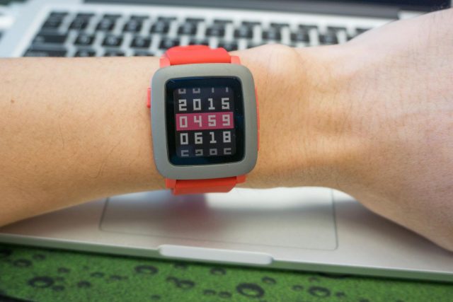
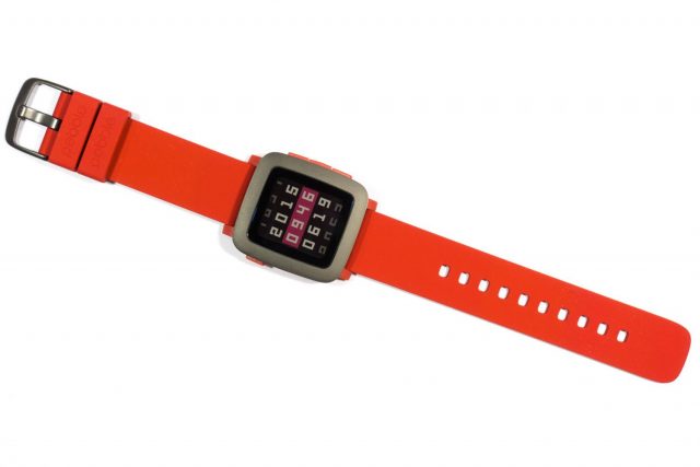
It’s time to take a look at the Pebble Time hardware! The basic Pebble Time is covered in a plastic body, and you have a couple of colour choices:
- Black body, black strap, and black bezel
- White body, white strap, and silver bezel
- Red body, red strap, and black bezel
The Pebble Time looks like a sporty gadget watch. It looks alright, although not something that would win design awards for its looks. I’m still undecided how a great smartwatch should look like. But it should not look clunky, and I’m glad the Pebble Time’s slimmer profile definitely wins over the originally Pebble.
The Pebble Time has a standard 22mm strap attachment, so if for any reason you don’t like the included silicon strap, you can easily find replacements on your own. That said, the Pebble Time’s silicon strap is really comfortable. The silicon material is surprisingly soft and feels very good. I hope it is as durable as it looks good.
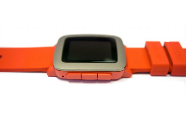
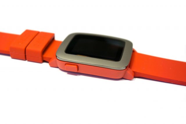
Since the Pebble Time has no touchscreen, four buttons on the side of the watch are your primary means of input. They are in exactly the same place as they were in the original Pebble.
The Up, Down, and Select buttons are on the right side, while the left side has a single Back button.
This time around, the buttons are far more comfortable to use. They don’t require as much force as they did before, although I still feel that too much effort is needed to engage the buttons. I cannot understand why they had to make it that difficult.
There’s a small little microphone hole that you can see on the right side down below the Down button.
Although it is not easy to see from the photo above, the Pebble Time’s body is very slightly curved to better wrap around the wrist. The Gorilla 3 glass on the watch face is, therefore, also curved slightly.
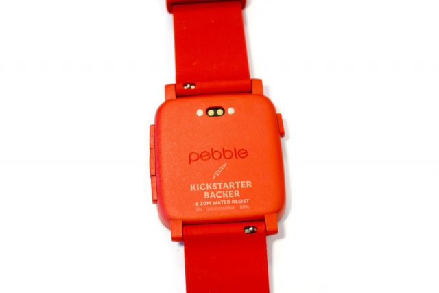
The charging ports that used to be on the left side of the watch are now on the back. That’s a good change. In the original Pebble, the exposed charging ports were quite an eyesore. The charging port on the Pebble Time is a much smaller.
The Kickstarter status is etched on the back of the watch. You can also see on this back view how the straps can be easily detached.
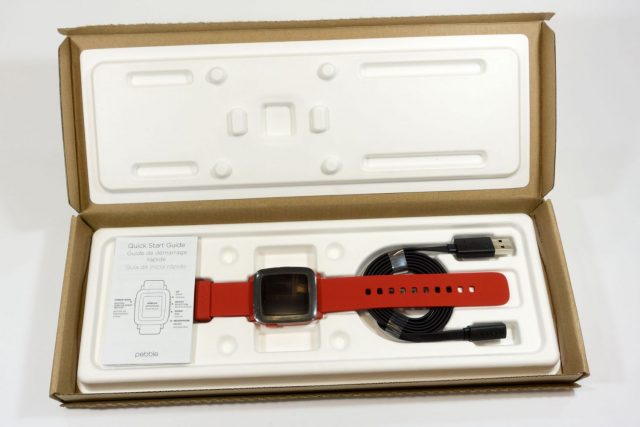
The Pebble Time ships with one charging cable. The charging port has changed between the original Pebble and Pebble Time, so you cannot reuse the old cable. Fortunately, given that the Pebble Time runs for one week on a single battery charge, it’s not like you have to bring the charging cable around with you. In fact, you could make short overseas trips without bringing the charging cable. That’s the beauty of e-paper display.
Apart from the basic Pebble Time covered above, there is also a Pebble Time Steel version that, yes, has a body made of stainless steel for that extra premium look. The Steel version will be available in three colours, black, silver, and gold, and will all include both a stainless steel strap and fine leather strap.
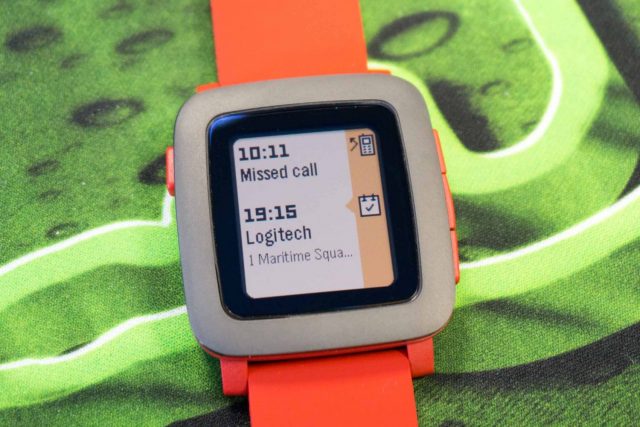
The Pebble Time’s 168 x 144 resolution may seem, well, underwhelming, and what more with a display that supports only 64 colours, but remember that this is e-paper display. It’s what enables the Pebble Time to sip so little battery, even though the display is always on. It may be low-resolution and lacking colours, but the display is perfectly functional. The new e-paper display is perfectly legible outdoors even under bright sunlight. It also works well indoors, but when in low light or darkness, a backlight automatically turns on when you shake or use the watch.
Unlike Android Wear or Apple smartwatches, the Pebble Time works with both Android and iOS smartphones, although the experience is not necessarily identical with both. On Android, you’ll need the new Pebble Time app Google Play store to communicate with the smartwatch.
The Pebble Time does the usual things that you’d expect from a smartwatch, such as viewing notifications and music controls. You can respond to messages, with template replies. More interestingly, you can respond with voice using the built-in microphone, which gets translated into text. It’s fun.
You can also run apps on the Pebble Time, of course. Pebble currently has 8,000 apps in their app store. One highlight is the Misfit app, which is does health, fitness and sleep monitoring. The Pebble Time on its own doesn’t do all that many things, but its functionality can be greatly enhanced through these add-on apps. While these apps run on the Pebble Time itself, some may require a companion app on the phone.
The Pebble Time will retail for US$199 when it hits the stores. It’s US$50 more than when the original Pebble’s retail launch price, but it’s still cheaper than most other smartwatches. On the other hand, it has fewer hardware features, but it does very well what it sets out to do.
Conclusion
The Pebble Time is an evolutionary upgrade from the original Pebble smartwatch. The new colour display is cool, and overall the smartwatch looks better than before especially with a slimmer 9.5mm profile.
Pros:
- Battery life of one week on single charge
- New e-paper display has colour
- Works with both Android and iOS smartphones
Cons:
- Low resolution display
- Few hardware features (no Wi-Fi, no GPS, no heart-rate sensor, etc)

View Comment Policy