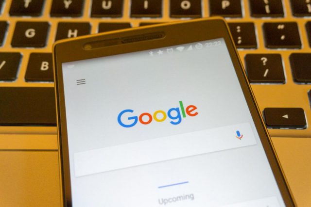
They’ve changed their logo again. Google’s. The last time, in 2014, it was so subtle that you’d be hard pressed to notice any difference even if you compared them side-by-side. This time around, the change is a lot more obvious, unless, of course, you’re quite oblivious to fonts. Their new logo sports a new font, Product San, of their own making.
The new logo is supposed to look more friendly. I personally think it’s a little jarring. It will take a little time to settle in, at least for me. It’s the boldest change they’ve ever had with their logo. Oh yes, yes, the actual letters are the same, the same colours are there. But the font is very different time time.
For starters, it’s sans serif. The logo had always been in a serif font. The motivation for this change may have got to do with the need to render their logo in smaller sizes than ever. The fine articulation of serif fonts might be too much, or rather too small, to be displayed clearly. Wait, not quite, with all retina-type resolutions becoming so prevalent these days, the problem is not with the display technology, but rather that our eyes will be more comfortable reading bolder san serif fonts.
Fonts are a big deal for some people. I sort of mind fonts a little too. That’s why you see I use a custom font on this website. Content is important, of course, but making the reading of content enjoyable through beautiful typography is a bonus.
If you’re interested, you can check CNN’s gallery on how Google’s logo has evolved through the years. They didn’t manage to catch last year’s tiny tweak though, but you can see my post about it. How do you like Google’s new font?

View Comment Policy