Google’s Pixel 2 XL launched with great excitement in October this year. However, once the device got into the hands of users, it picked up a long list of complaints. One of the complaints had to do with colours on the new LG POLED panel. Almost everyone thought the colours were extremely dull, muted, and just not right.
I felt that way too, initially. I’m quite particular about colour accuracy, or at least I thought so, and I thought the Pixel 2 XL colours were just wrong. All the familiar icons on my home screen suddenly looked like they were rendered with the wrong colours.
Google’s explanation is that the Pixel 2 XL’s display was tuned to show more natural and accurate colours. This is a departure from most current smartphones. OLED screens are typically more vibrant and display more saturated colours. That’s what most users like to see too, and screens that display more vivid colours are perceived to be better. We’ve become so used to these colours that we’ve come to consider them to be correct. Even though they don’t truly represent reality.
However, most users, or at least a sizeable proportion of them, didn’t buy Google’s story, and Google eventually had to release a software update to the Pixel 2 XL that brought back “Saturated” colours. There are two other options, Boosted and Natural. I can see that Saturated is really, well, saturated, but to my eyes, Boosted and Natural looks the same.
Anyhow, over time, I seem to have come to accept that the Boosted mode I’m using now is “correct”. Truly, photos look a whole lot more realistic. I’ve made some comparisons between the Pixel 2 XL and Pixel XL showing the same photos. It’s hard to tell from a photo of photos the naturalness of colours, but you can easily see that the colours on the two smartphones are different.
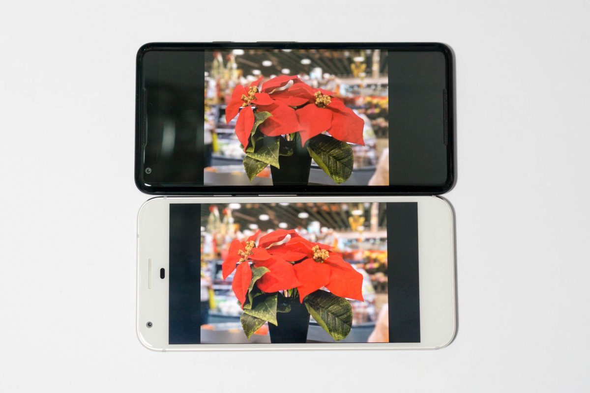
The red really pops out in the Pixel XL above. You can just imagine how unrealistic it would be if you had seen the photo on the actual device in real life. (In all comparison photos here, the Pixel 2 XL is on top, while the Pixel XL is at the bottom.)
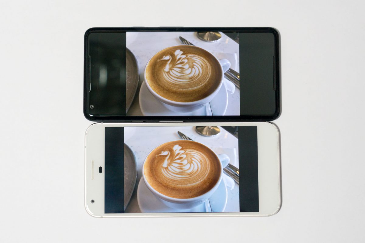
The next photo is of a cup of coffee. It’s easy to see that the coffee colour on the Pixel 2 XL is far more accurate. The orangey tone rendered by the Pixel XL is just too unreal. The nice coffee, incidentally, is from Atlas Coffeehouse at Duke’s Road.
I compared several more photos and decided that I’ve come to prefer the more accurate colours on the Pixel 2 XL.
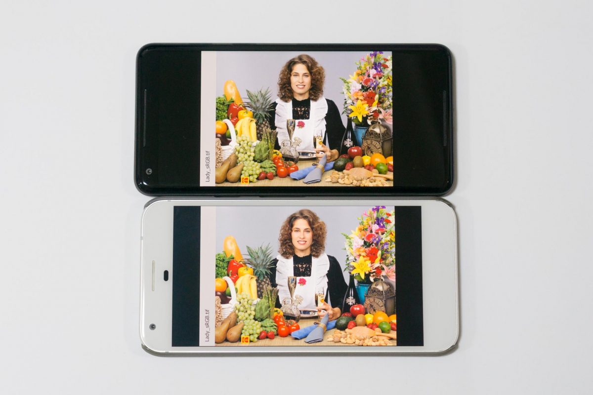
For a further comparison, I obtained a test image from https://news.artnet.com/app/news-upload/2016/12/Kodak-sRGB.jpeg. You can see the comparison between the Pixel 2 XL and Pixel XL below.
More interestingly, I also have a comparison between the two smartphones and the display on my MacBook Pro. My MacBook Pro’s display isn’t colour calibrated, it’s just how it came out of the box. It doesn’t count as the best reference, but at least for my purpose, it serves as a comparison of how the same photo would have appeared on other devices which are not smartphones.
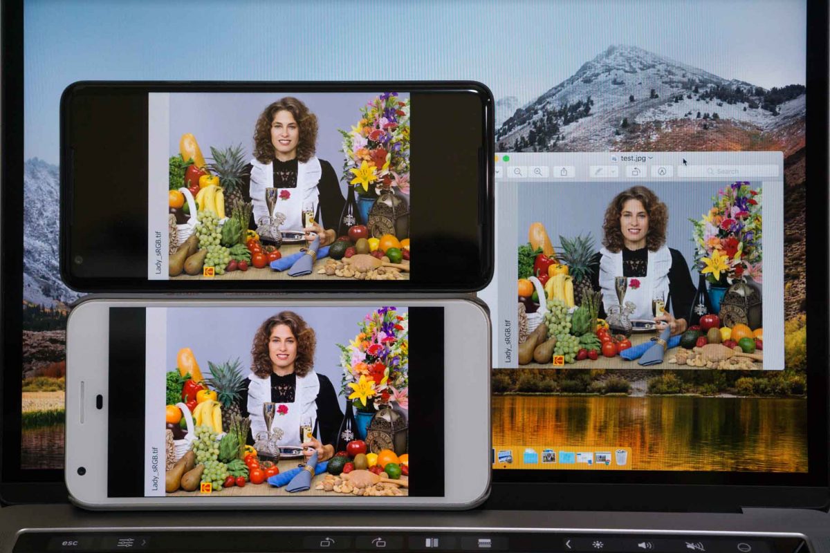
Comparatively, the Pixel 2 XL’s display still comes across as slightly more vivid than that of the MacBook Pro. Overall, however, it’s clear that the Pixel 2 XL’s colour rendering is more accurate than the Pixel XL.
Apple described their removal of the 3.5 mm headphone jack as courageous. I think that that was a matter of evolution. Somebody had to dare to make the first move, but it was a matter of time before it happened.
The case for Google to move to natural colours, however, is a bold move against the trend of other smartphones. It was a bold move against what users wanted, or at least thought they wanted. No doubt this is a move that Google could reverse with a software fix, but they risked upsetting impressions of their flagship product.
All these years our eyes have been spoilt by boosted saturation on our smartphone displays. I also became affected, initially finding the Pixel 2 XL’s colour really odd. But now, I’ve to thank Google for reminding me of what the colours ought to be. Now my eyes hurt when I look at a Samsung smartphone display.
View Comment Policy