
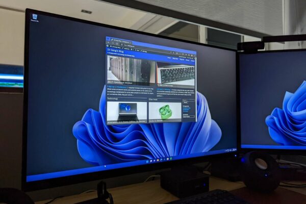
I’ve gone with a dark theme on most of my gadgets — phones, tablets, and laptops — but for a long time, I’ve not come around to turning my blog dark. Well, it’s finally done. If you visit from a browser client that “prefers dark”, you’ll see a dark rendition of this blog.
The last couple of years, dark themes have gained in popularity. Did you know that in the old days, it was actually the norm for text to be displayed in a lighter colour against a black background? Remember those monochrome CRTs that displayed green text on a black background? I had a knock-off Apple IIe — my first ever personal computer. Colour-capable displays in those times typically also displayed elements in lighter colour against a dark background. This, basically, is dark mode.
Then, as graphical user interfaces developed, it became a thing for your computer display to depict objects in a way that resembled their real-world counterparts. Documents, for example, should be rendered in black text against a white background, like how the real world uses black ink on a white paper. For the longest time, this skeuomorphic approach was used to familiarise people with computers. Everything was rendered in a lighter background, because supposedly, there wasn’t that much darkness in the real world, at least not in the day time anyway.
Black-on-white has been the norm for well over two decades. If you ever saw dark mode at the turn of this century, it’ll probably be associated with old, outdated, computers that didn’t quite belong in the current era.
However, we’ve since started to see dark mode making a comeback. In some cases, there are technical reasons for dark mode to be preferred, such as on mobile devices using AMOLED screens which will consume less battery display dark mode. Videos and games could be also more visually appealing in dark mode.
So in recent years, dark mode support has started to become more commonplace. Many applications and websites offer dark mode support, and its availability is often highlighted as a “new feature”.
Sometimes, dark mode is even the default out of the box. This is especially case for many apps used by designers and developers. For example, Adobe Photoshop and Lightroom defaults to dark mode. Coding editors like VS Code also default to dark mode.
I personally like dark mode, but not with excessive contrast. So a 100% white against a 100% black is too jarring a contrast for me. Something just slightly subdued works best in my opinion. Having a slight hue on the “dark” is also nicer than a pure gray, so that there is a hint of some personality.
Dark is the new light. I appreciate that some will prefer light. If your browser says you prefer light, you’ll still see this website in light mode. I finally got around to fixing up the theme, because while most things on my screen is dark, this website has been jarringly bright.
I was recently reminded that this blog turned 15 years old last month. This visual update will serve as a little celebration for 15 years of blogging, a milestone that has otherwise gone by quietly. I haven’t had time to post much in the last year or so, but I’m hoping to pick up the pace in the next couple of months.
View Comment Policy