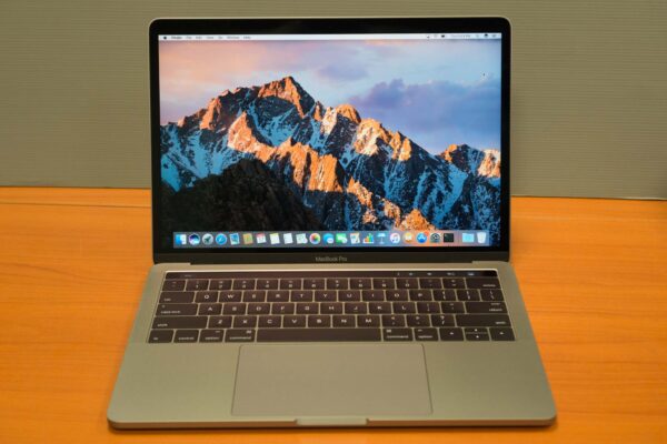
After waiting four long years, Apple has finally unveiled a brand new MacBook Pro design. The last time any spec was refreshed at all was in early 2015, which is longer than what you might even expect from other manufacturers. There are high expectations of this new MacBook Pro, and we’re keen to see what it has brought to the table.
New things the new MacBook Pro definitely has plenty of. At the same time, some of us might be apprehensive about Apple’s eagerness to throw out old things. In 1998, for example, they dropped floppy disks in their then new iMac G3. They put CDROMs on the death row starting from the MacBook Air in 2008. This year, they removed the headphone jack on the new iPhones. The MacBook Pro of 2016 was unveiled with a bunch of stuff missing. I’ll get to that.
The good thing, though, is that there’s also a lot of things new on the new MacBook Pro. It’s thinner, less voluminous, and lighter, to begin with. The new display is brighter and has a wider colour gamut. The Touch Bar models have a 60 x 2170 pixel OLED touch display with Touch ID sensor integrated into the power button. The SSDs are hugely faster, and there are updated processors.
The unit I have for this review is the 13-inch MacBook Pro with Touch Bar. It is the lower-end of two 13-inch Touch Bar versions, with RAM upgraded to 16GB.
I previewed the entry-level 13-inch MacBook Pro recently. Those have lower hardware specifications in the base configuration, but the primary difference in the entry-level MacBook Pro is the absence of Touch Bar. It was immediately available after Apple’s unveiling in late October. The Touch Bar versions became available later, with the 15-inch one last week and the 13-inch one following closely after.
Unboxing Apple hardware is always an experience in itself. This year’s MacBook Pro arrived in smaller shipping boxes. They still do offer great protection during shipping. The retail box inside is smaller, naturally because the notebook within is smaller, but there’s less “air space” inside the shipping box too. I’m surprised Apple didn’t make a big issue about how they’re reducing shipping wastage and being more environmentally friendly like they’ve done before.
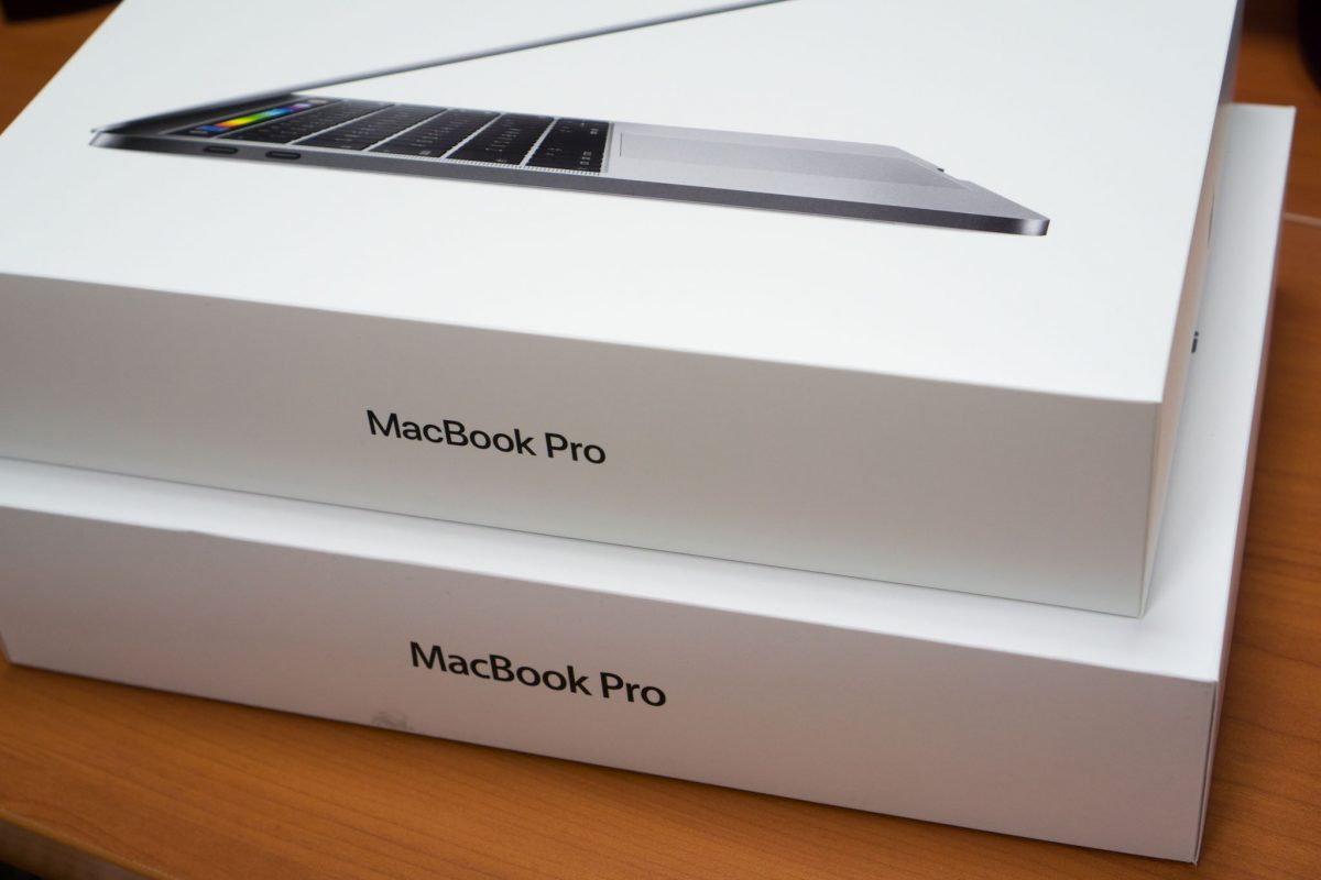
Just for comparison, you can see how the 13-inch retail box is smaller than the last generation’s 13-inch box. The footprint of the box is just barely larger than the MacBook Pro itself.
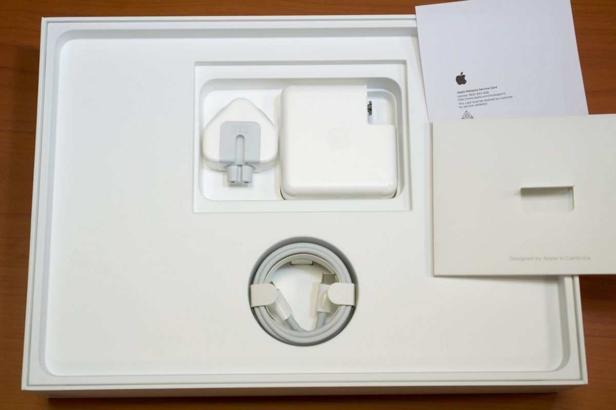
Inside the box, under the MacBook Pro, you’ll find the bare few accessories included: the power brick, with a plug adapter appropriate for your country, and a USB-C to USB-C cable. If you’re familiar with previous MacBook Pro, Apple has now omitted the power cord extension cable. That cable is available as a separate purchase.
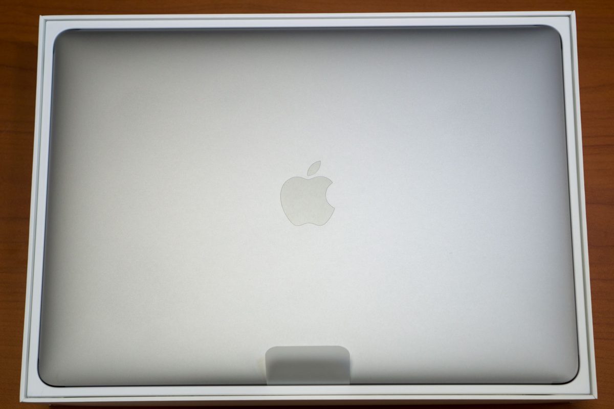
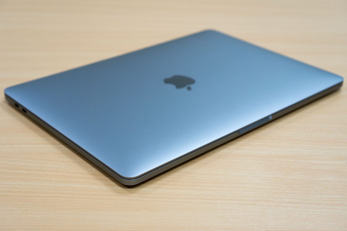
The Apple logo on the back of the cover that was once illuminated is now replaced by a shiny metal finish, just like on the 12-inch MacBook. I miss the glowing logo. Whenever I had to speak before an audience, I could easily get a sense of the number of Mac users because of all the illuminated Apple logos. Now, it’ll be much harder to identify Mac users in the audience.
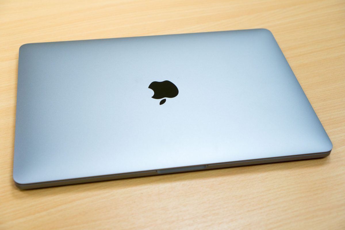
The new 13-inch MacBook Pro measures 304.1 x 212.4 x 14.9mm, and weighs 1.37kg. Yes, it’s less voluminous than the 13-inch MacBook Air. In fact, it’s also thinner than the thicker end of the MacBook Air. This new MacBook Pro is clearly in ultraportable category now.
The right side of the MacBook Pro has a 3.5mm headphone jack and two USB-C (USB Type-C) ports. Thank goodness for the 3.5mm headphone jack, but the USB-C ports are the only other type of ports available on this new MacBook Pro.
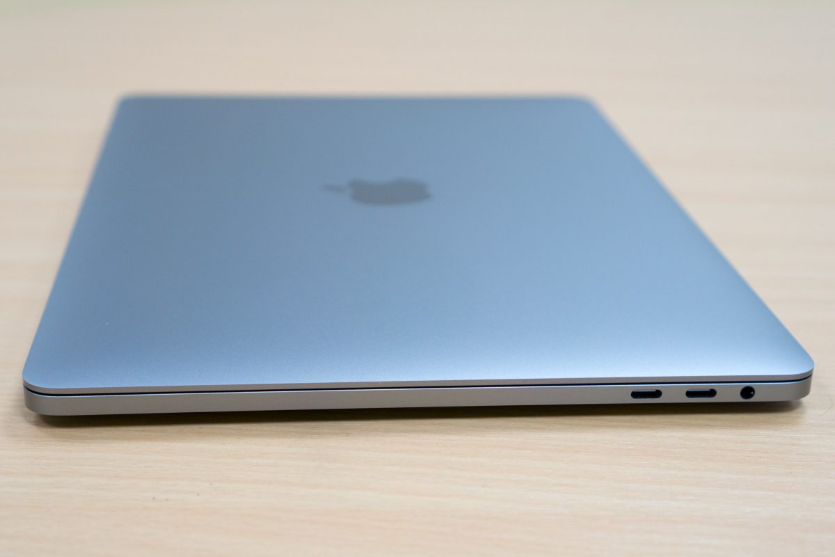
That means there’s no more legacy USB Type-A ports, no more Mini-DisplayPort or Thunderbolt or Thunderbolt 2 ports, no more HDMI ports, and, no more SD card slot. Apple’s legendary MagSafe or MagSafe 2 ports are also gone. Everything is now USB-C, safe for that lone 3.5 mm headphone port.
This has cooked up a big storm amongst MacBook Pro users, and even heavily criticised by others who don’t use Macs. In this year’s iPhones, Apple was so bold as to remove the 3.5mm headphone port, but somehow they felt necessary for it to be retained in the MacBook Pro. Yet, all the other legacy ports were removed from the MacBook Pro. Are those other legacy ports any less important than the 3.5mm headphone port?
I’m sure we can all understand the move forward to support USB-C. But I think many of us question Apple’s decision to totally embrace so quickly and so exclusively the new USB-C ports. We aren’t all ready to give up on USB Type-A just right yet. Photographers, especially the more professional ones, and even the not-so-professional types like myself, use the SD card slot a lot.
Many of us have appreciated the diversity of ports in the last generation MacBook Pro. It’s a “pro” notebook, and it needs to connect many things. Now some of us might start to wonder if the MacBook Pro is a pro notebook, or perhaps a notebook version of the iPad Pro.
Moving around to the left side of the MacBook Pro, you’ll find the two other USB-C ports. So that’s it, we’ve seen all the external connectivity options for the new MacBook Pro, at least the physical types.
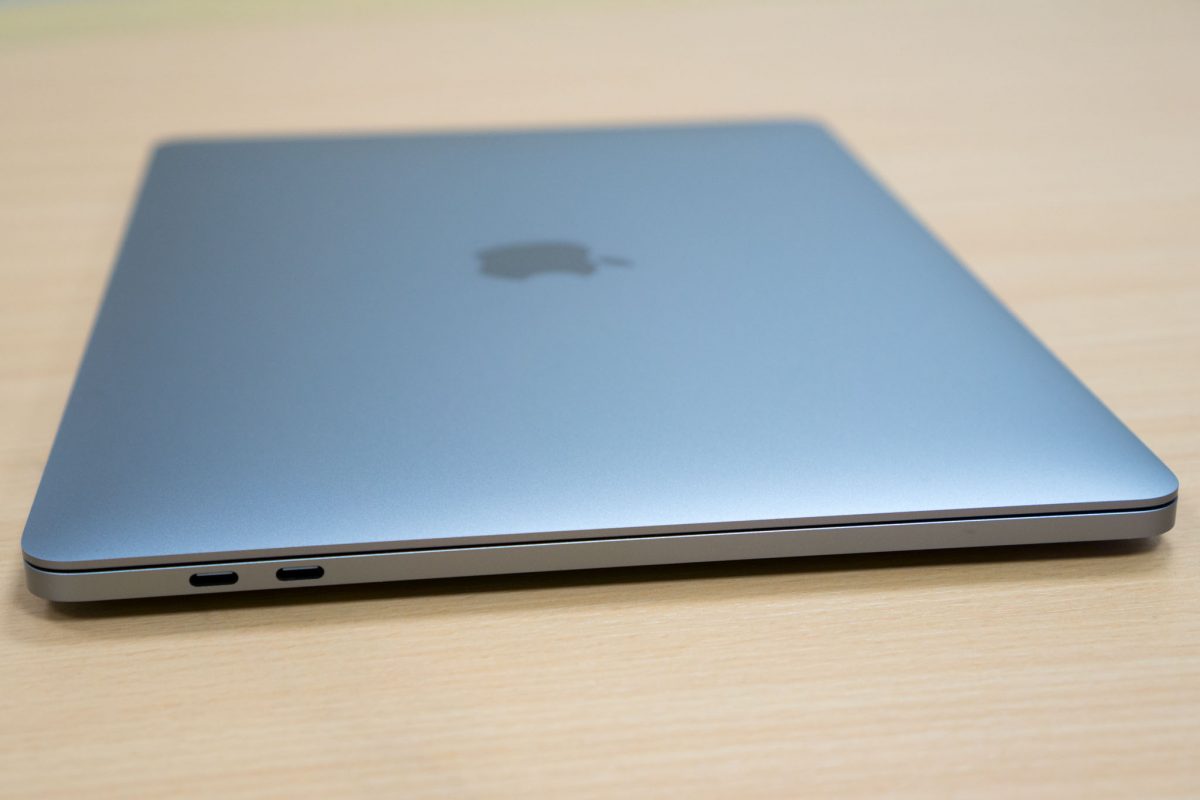
USB-C is supposed to be really cool. It really is, actually. The four USB-C ports on the MacBook Pro support Thunderbolt 3 with speeds up to 40Gbps. They also support USB 3.1 gen 2 with speeds up to 10Gbps. They support USB Power Delivery as well, so you can use any of them for charging.
Wireless interfaces include 802.11ac Wi-Fi with speeds up to 1.3Gbps, and Bluetooth 4.2.
The MacBook Pro has three microphones and improved high dynamic range stereo speakers. Interestingly, according to a iFixit teardown, the speakers not actually under the visible grills beside the keyboard, but at the far edges under the palm rest area. This is different from the entry-level MacBook Pro model, which does have the stereo speakers located on the grills. In the Touch Bar models of the MacBook Pro, the grills appear to be mostly cosmetic.
Most notebook speakers are usually unremarkable. The last MacBook Pro was perhaps just passable. The new stereo speakers on this MacBook Pro are actually quite good. The low-end is filled in better than before, and the speakers play much louder too. No, this won’t replace a $200 Bluetooth speaker, but if you had been using any cheap speakers before, this MacBook Pro will do better than them.
The 13-inch screen is still the same native 2,560 × 1,600 resolution with 227 ppi as before. But it’s also different. It’s 67% brighter than before, maxing out at some 500-nits of brightness. The screen also has higher contrast ratio and a 25 percent wider colour gamut that now includes the P3 colour space.
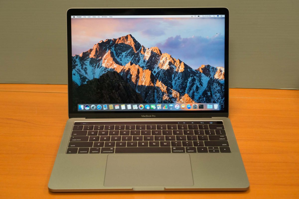
For many years, the MacBook Pro did not have its name emblazoned anywhere obvious. (It was printed on the underside of the notebook in the last generation MacBook Pro.) This time, Apple somehow felt it necessary to put back its name on the screen, below the active display area.
Finally, let’s talk about the keyboard and the new Touch Bar. The keyboard is the new flat style design we’ve seen in the 12-inch MacBook. It does use a new second generation butterfly mechanism. It does provide more stability than in the 12-inch MacBook. The 0.5mm key travel is awfully short.
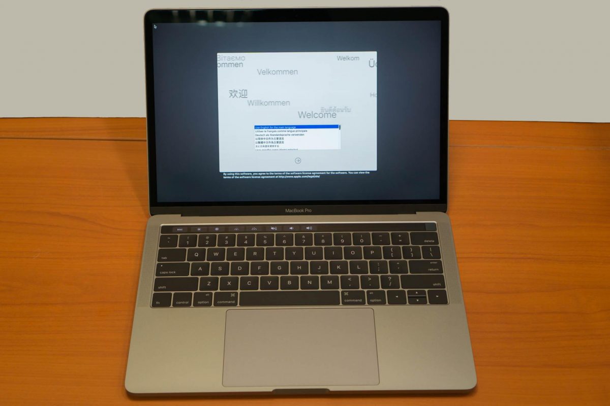
I type a lot, and I thought the key travel would be a serious issue for me. This is one of the things I set about to try immediately, as I did with my earlier entry-level MacBook Pro preview. Surprisingly, the shallow key travel isn’t a real problem if you don’t think about it. That’s right, if I just go ahead and type, not thinking about the flatter keys at all, I found that I could pretty much type just as well as I did before on the old style keyboard.
The flatter keyboard has the benefit of sitting relatively flush with the Touch Bar, so that using the Touch Bar wouldn’t involve such an abrupt difference in experience. Now, the Touch Bar is going to feel different, and is used differently, but at least your fingers don’t have to transition between surfaces that sit at significantly different heights, and the “zero travel” of the Touch Bar becomes less shocking than the 0.5mm travel of the real keys.
To be really honest, I don’t miss the function keys a lot. I didn’t really use them anyway, at least not in regular typing or in using most apps. However, I am a command line terminal user, and I use vi a lot. As others like me will understand, I need the Escape key a lot. It would have been nice to get a real Escape key. I don’t mind losing other keys in that function row, but not the Escape key.
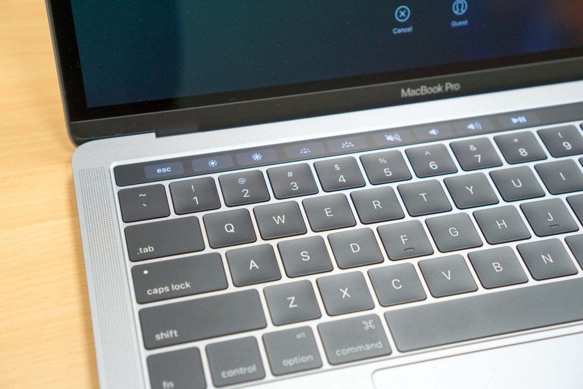
But the Touch Bar is there now and the Escape key is gone. Can I ever get used to the Escape key virtualised within the Touch Bar? Well, it will take some getting used to. The fortunate thing is that the Escape key sits in the top left corner. Aiming blindly in the top-left area of the Touch Bar usually will hit the Escape button in the Touch Bar. It’s exact centre, laterally, in between the ` (tilde) and 1 keys, so even if you touch type, you could orient your fingers based on where those physical keys are located.
A real, physical, Escape key would have been perfect. What the Touch Bar offers for the Escape key could be something I can get used to.
The Touch Bar is, probably, to the late-2016 MacBook Pro what the Retina display was to the third-generation MacBook Pro in 2012. The Retina display was amazing. I used to joke how the Retina display would spoil your eyesight, because after seeing it, you couldn’t tolerate to see the pixelation on older displays. Well, the Touch Bar isn’t so revolutionary, unfortunately.
The Touch Bar is essentially a secondary 60 x 2170 resolution touchscreen interface. Apple has refused to put touch on their screens. While I do appreciate touch-enabled interface in Windows 10, I also don’t disagree with Apple’s position on a touchscreen MacBook Pro. This new Touch Bar is like the answer for those who want touchscreen, albeit a very small one that sits above the keyboard.
The basic use of the Touch Bar is to replace static function keys, which are seldom used on the Mac, with buttons that can change depending on what you’re doing. Apps can use the Touch Bar to provide application-specific function. They don’t actually have to be individual discrete buttons. You can, for example, scroll through photos in the Photo app, or scrub through your video timeline in Final Cut.
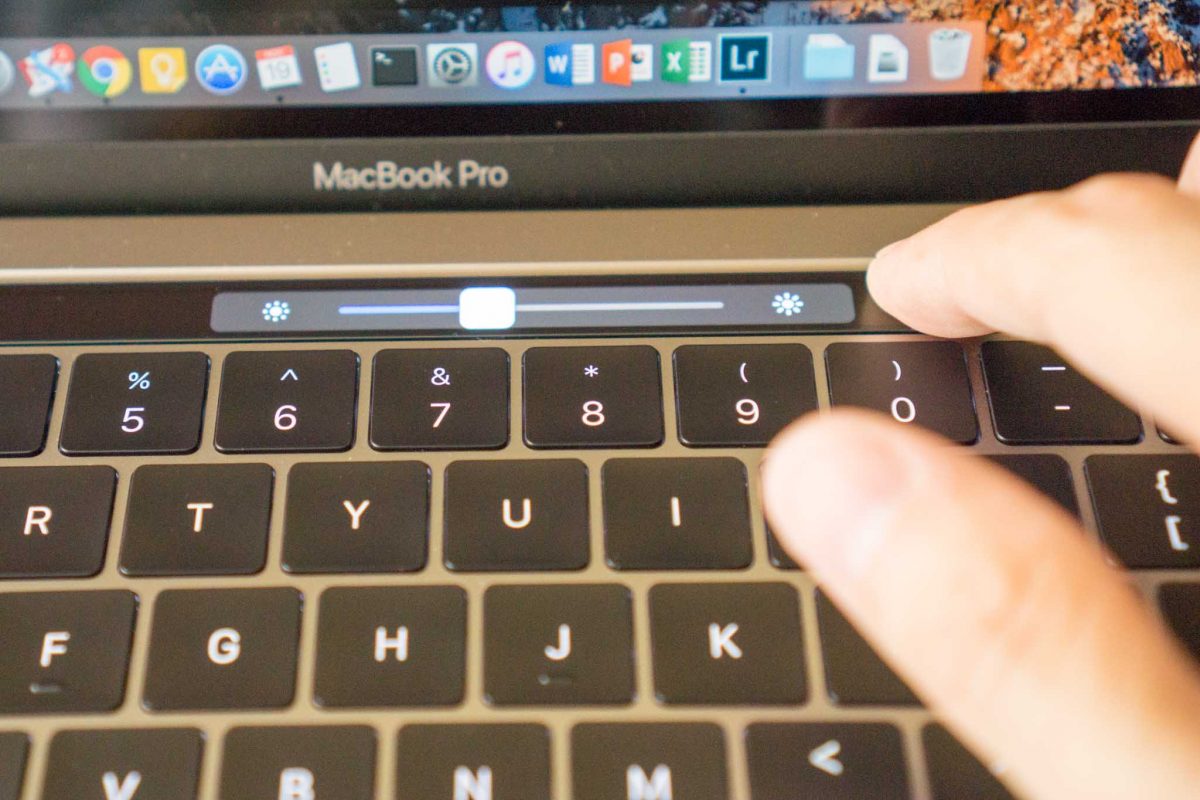
There are some fixed buttons on the Touch Bar, and these are on the right-side. Fixed means that applications cannot change them, but you can customise the buttons to suit your preference. The default buttons provided allow you to invoke Siri, Mute, Volume control and Brightness control. The control adjustment slider show up when you touch the Volume or Brightness button. However, instead of lifting your finger and moving it over to the slider control, you can slide your finger directly from where you touched the button to adjust the respective controls.
The Touch Bar at this time seems mostly gimmicky. I can see how they can be useful, but right now it’s mostly only Apple’s own apps are using them, sometimes only in basic ways. Some third party apps have begun to support the Touch Bar, like Airmail 3, 1Password, and PicFrame, but again their use of the Touch Bar is basic. There’s a lot more potential for the Touch Bar, and perhaps it’s full potential will only be realised many months down the road.
Along with the Touch Bar, the new MacBook Pro also has a Touch ID sensor, the first Apple has put in any of its notebook. The Touch ID sensor is integrated into the power button, and sits on the right side of the Touch Bar, which is basically where you’d expect to find the power button on the older MacBook Pro.
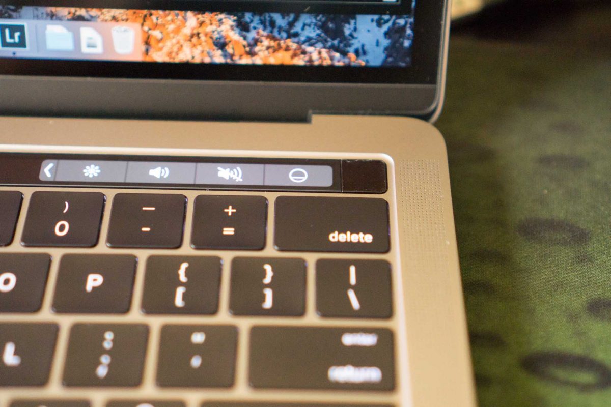
Touch ID is used to unlock the Mac, for payments in Apple Pay, and for purchases in iTunes and the Mac App Store. It’s possible for third party apps to make use of Touch ID too. The 1Password password management software, for example, can use Touch ID to unlock your password vault.
With Touch ID, unlocking your Mac is so much more convenient. The Touch ID sensor is fast and accurate, like how it is in iPhone devices. Your password is still needed, however, when your Mac boots up.
Worth noting is that the trackpad is now 46% larger than the previous MacBook Pro. It’s otherwise the same, feature-wise, as before: Force Touch, glass, super smooth, really accurate, and a real joy to use. Apple’s giving us more things than ever to touch, with the bigger trackpad and the new Touch Bar, but just not touch screen.
Under the hood, this new MacBook Pro is powered by a 2.9GHz dual-core Intel Core i5 Skylake processor with 8GB 2133MHz LPDDR3 SDRAM in the base configuration. The processor can be optionally upgraded to a 3.1GHz Intel Core i5 Skylake processor or 3.3GHz Intel Core i7 Skylake processor. The RAM upgrade tops out at 16GB.
The base configuration comes with 256GB of NVMe PCIe flash storage, upgradeable to 512GB or 1TB. This new storage is a real speed daemon. If you’re familiar with the Blackmagic Disk Speed Test program, well, the MacBook Pro’s new storage reads so fast it blows past the app’s speed limit.

Some users were disappointed that Apple didn’t put Kaby Lake processors into the MacBook Pro lineup. Apple couldn’t include Kaby Lake because the processors are not yet available at the performance level required in the MacBook Pro. Apple isn’t the only one. As Gizmodo explained, Microsoft’s new Surface Studio PC also runs on Skylake processors for the same reason. The only Kaby Lake processors currently available are the kinds that go into ultra-thin notebooks (like the 12-inch MacBook) and tablets. At any rate, Kaby Lake might not be such a big deal anyway, because it’s neither a ‘tick’ nor a ‘tock’ in Intel’s processor development model.
On the Geekbench 4 benchmark, this MacBook Pro gives a single-core score of 3898 and a multi-core score of 7460, a respectable improvement over the last equivalent MacBook Pro from early 2015 which scored 3697 and 6879 respectively.
The new, late-2016 MacBook Pro delivers a welcome upgrade, with many improvements to like. The thinner, lighter, and ultraportable mobility is nice, as is the new, brighter, and more colourful screen. The stereo speakers sound good. Touch ID is a really useful feature to have. The Touch Bar seems a nice gimmick for now, but it has potential to be much more useful in future. I think this is a great upgrade if your last Mac was from the 2012 or 2013 era. But if you had the early-2015 MacBook Pro, it’s probably tougher to decide — the new MacBook Pro is still all-around an upgrade, except for the loss of ports, and then there’s the price.
Conclusion
The new MacBook Pro is more portable than ever, has a great screen, and really useful Touch ID. Then, there’s also the cool Touch Bar that everyone can wow over. The loss of legacy ports will need some adjustments.
Pros:
- Thinner, lighter, and more portable
- Better screen, brighter and more colourful
- Touch ID is useful
- Faster performance, especially storage
Cons:
- Only USB-C ports
- Because of the above: No SD slot, no USB Type-A, no HDMI, no Mini DisplayPort
- No MagSafe 2!
Thanks for your review. This is awesome.
Have you tried connecting to network swiches via serial cable on your new macbook pro.
I am much interested in the 2016 macbook pro myself, however, doesn;t know if i can still connect to my network devices via serial console.